Additional options

Contents
With the release of version 5.10.5 at the start of 2015, a swag of new options was added for controlling quantiles:
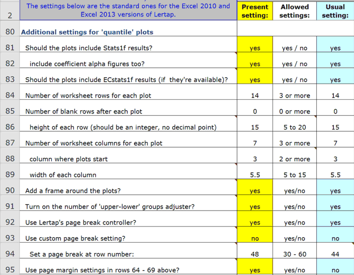
There's so much to say about these options that we ask you to branch out to a special topic paper.
Row 95 makes reference to rows 64-69, mentioned in this topic.
In early 2016, additional options were added in rows 96, 97, and 98. Then, in the Lertap 5 versions of 1 June 2018, row 99 came to have an entry too:
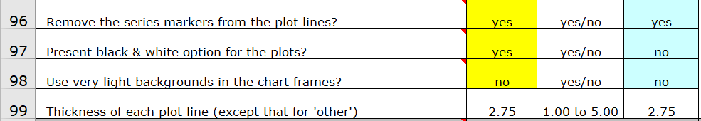
Rows 96 and 97 have to do with a special macro called "QuantileShader1".
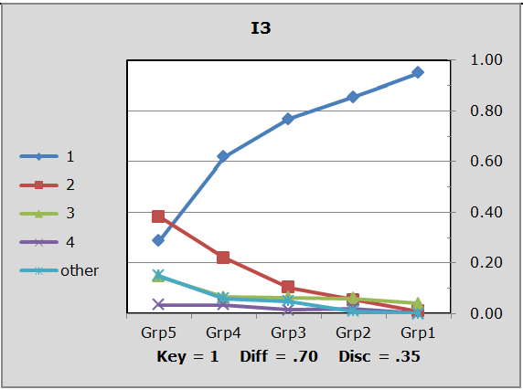
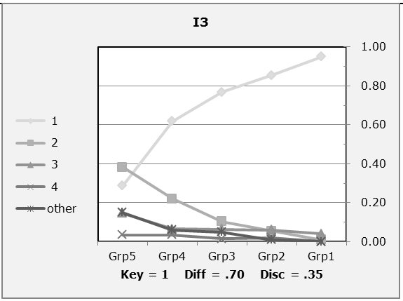
Row 98 affects the shading in quantile plots. When row 98's second column is set to "no", a quantile will look like this:
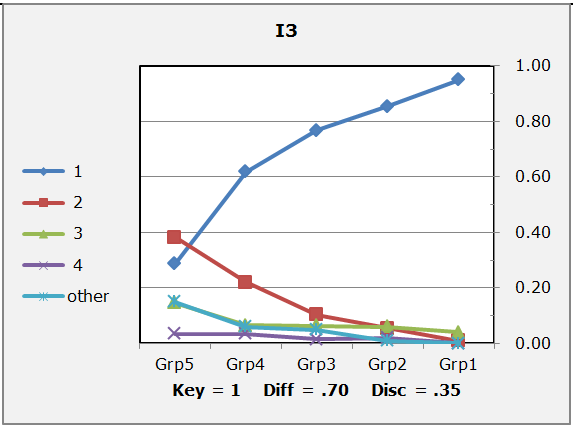
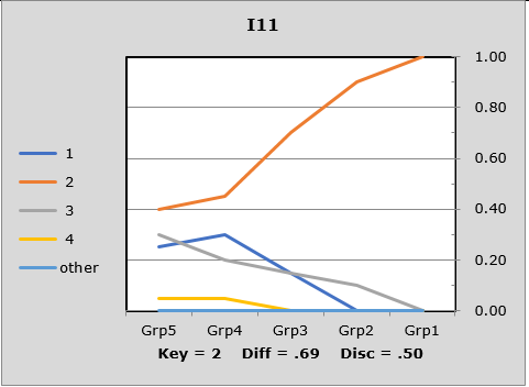
When row 98 is set to "yes", the shading of the chart area is a bit lighter:
Can all colors be washed out of these charts / plots? Yes. One way, a quickie, is to use Excel's Page Layout tab, Colors, Grayscale:
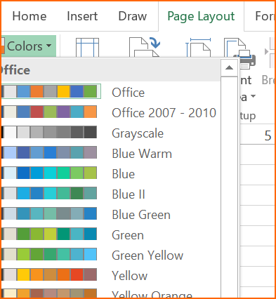
Here's the plot in Grayscale:
The "QuantileShader1" macro may also be used to alter colors.
The row 99 setting was added after Excel 2016 changed the default setting for line thickness. In Excel 2010, the lines in these plots had a default thickness of 2.25. This changed in Excel 2016, when 1.50 became the default thickness.
All of the plots exemplified above have a line thickness of 2.25 and were made using Excel 2010. The plot below, made with Excel 2016, used 1.50 for its line thickness, and, for this plot, line markers were not in use:
All versions of Lertap5 dated from 1 June 2018 allow quantile plot line thickness to be controlled by the setting in row 99 of the System worksheet.