Quintile plots

Contents
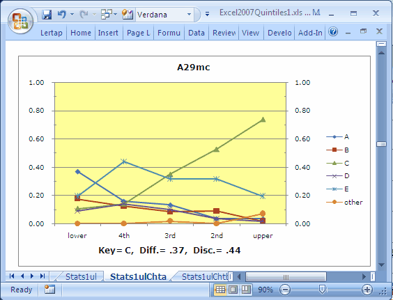
![]() When a Stats1ul-style report is active, a click or two on this icon will produce charts such as this 'un:
When a Stats1ul-style report is active, a click or two on this icon will produce charts such as this 'un:
Note: these plots took a big leap forward with the release of version 5.10.5 in January 2015. They're now a bit fancier, and, in particular, more complete as they can pull in information from Stats-f and ECStats-f summaries, resulting in a significantly more comprehensive summary of item performance. Read all about it here, and see numerous examples here.
The 'quintile-a' plot pictured above shows how five item options, {A,B,C,D,E}, performed over five groups: 'lower' achievers to 'upper' achievers, with three intermediate levels of achievement. The variable used to index achievement may be internal or external; internal is the default, and is simply the total test score. The number of groups is usually five (hence the term "quintiles"), but may be less -- it's an option set in the System worksheet (see this topic).
The 'other' line generally represents respondents who omitted the item.
Wainer (1989) referred to plots similar to the one above as 'option trace lines'. If you haven't seen these before, have a careful look at their message: the green line (with small triangles on it) corresponds to the keyed-correct answer, C. The proportion of people in the lower group who selected this option is 0.11, a figure which steadily increases as we get into higher levels of achievement; by the time we get to the 'upper' group, the proportion able to pick out the correct option has increased to 0.74. The graph clearly shows an (almost) linear relationship between achievement and ability to identify the item's correct answer.
Distractors A and B foil fewer and fewer respondents as achievement level increases. Distractor E is quite popular with the lower achievement groups, falling away in the top (upper) group.
Okay? Great; now let's swap things around a bit, and look at the data from another angle:
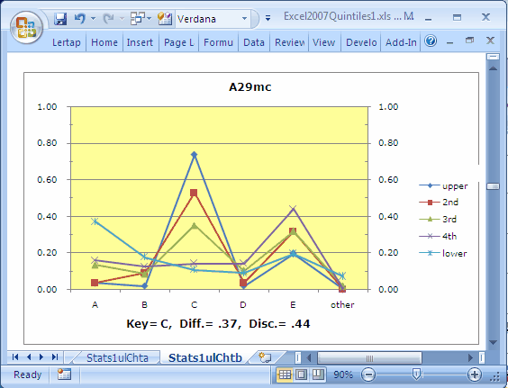
This graph, a 'quintile-b' chart, plots achievement groups over response options. It shows, in the case of item A29mc, that the most popular response is in fact C, the correct answer. Distractor A nicely pulls off the three lowest achievement groups, especially the very bottom (lower) one. E is a fairly popular choice for the three middle achievement groups, with more than 40% of the 4th group (the next to lowest group) distracted by it.
Items which are good at discriminating the knows from the know-nots will have a particular quintile-b profile: the trace for the upper group, the "knows", will be the highest peak above the keyed-correct option, and the lowest peak for all the other options. The more it's the highest above the key, and the more it's the lowest everywhere else, the more the item discriminates.
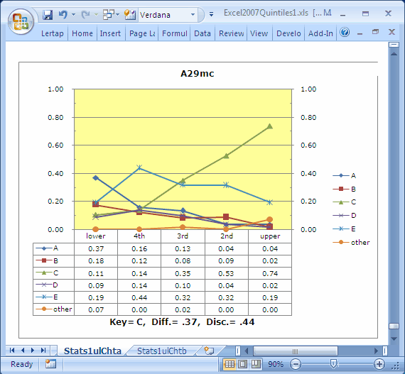
Lertap's 'quintile plots' are of course just Excel charts. As such you can change them easily. A chart may be selected in a number of ways; once selected a great variety of chart options may be played with. Below we've asked Excel to include the actual data from which the 'quintile-a' chart was derived (Excel refers to the table below the graph as the "data table"):
These plots are handy. For some users, they may well be more informative indicators of item functioning than any other Lertap report or graph. How do you get 'em? Simple. First, make sure you've got the number of groups setting in the System worksheet right. You can have from 2 to 10 groups.
Then, make Stats1ul (or Stats2ul, ...) the active worksheet by clicking on it. Next just mouse up to the Lertap toolbar, and click on ![]() .
.
Lertap will click into action, opening up a new worksheet called either Stats1ulChta, or Stats1ulChtb, depending on a setting in row14 of the System worksheet. The default action: the first time you click on the icon, 'quintile-a' plots are made for each item, and placed in Stats1ulChta. The next click creates 'quintile-b' plots, recorded in the Stats1ulChtb worksheet. You can reverse the order via that setting in the System worksheet. To use different colours for the trace lines, see the Chart colors topic.
The Diff and Disc figures seen in the plots are taken from the "b" report which corresponds to the subtest involved. If you're clicking off of a Stats1ul report to get your plots, the Diff and Disc values are taken from lines in the Stats1b report. Note that the Stats1ul report has its very own diff and disc values; these are conventional upper-lower indices; in a way they're inferior to the values found in Stats1b in that they're just based on results from two groups -- the lowers and the uppers -- whereas the corresponding values in Stats1b are based on all test takers. (The Disc figure in the Stats1b report is a corrected point-biserial correlation coefficient.)
Note: items with negative discrimination ("disc.") are flagged in the plots by the use of red coloring. The item's label will be red, and the statistics below the chart will also be red. An example may be seen by clicking here.
SAQ: If I change the number of groups, maybe even to just two, can I still get 'quintile plots', even though I no longer have true achievement quintiles? Sure.
SAQ: And, can I get these marvellous graphs even when my Stats1b report is based on a mastery test? Yes, go for it (Master)!
Related tidbits:
These charts changed substantially when version 5.10.5 was released in 2015. It's now possible to incorporate information from Stats-f and ECStats-f summaries. This document has the scoop you'll want to see; note that the "Using Lertap Quintile Plots" PDF document referenced in the next sentence has many examples of the new charts.
There's a paper, a best seller, which has a lot more to do about using quintile plots: UsingLertapQuintilePlots.pdf (pdf file, about 400 KB).
How to print quintile plots is discussed in this topic.