ChartChanger3 settings and use

Contents
ChartChanger3 is by far the easiest way to pack your plots if you have Excel 2010 or later.
To use it you must first have a set of quintile-like plots on hand (we say "quintile-like" as quintile implies five groups; if you have fewer groups the plots are not really quintiles, but, well, just play along, if you would).
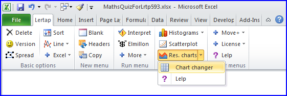
A reminder on how to get quintile plots. Start by viewing a Stats1ul sheet. Then click ![]() , the Res. charts option.
, the Res. charts option.
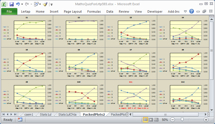
This will result in a new worksheet, or Lertap "report", with one plot for each item arranged in a top-down manner: item one at the top, followed by item two below it, and so on. Such reports have names like 'Stats1ulChta'.
While viewing these quintiles, ChartChanger3 is then activated by clicking on the 'Chart changer' option.
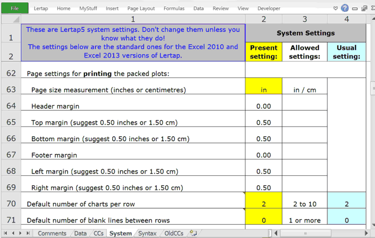
What we've just described is a two-step process. You can make it a single step by going to the System worksheet and changing Row 60's 'Present setting' from 'no' to 'yes'. Once this is done, a new worksheet, "PackedPlots", will accompany the Stats1ulChta report (the rows seen below start at Row 62 -- scroll up to Row 60).
Plot packing involves moving charts so that they lie more than one to a row. In the example below there are four to a row.
The number of charts in a row is controlled by System worksheet Row 70. You can set it to whatever you prefer; 2 is a suggested default value.
It is possible to insert a blank row between the packed plots, as seen here:
The number of blank rows, or lines, is controlled by Row 71 in the System worksheet.
If the "interactive mode" setting in Row 61 is set to 'yes', then the values entered in rows 70 and 71 are ignored, and you're asked to enter them as soon as you've activated ChartChanger3. However, if "production mode" is set to "yes" in System row 35, then the "interactive mode" setting is ignored and the values in rows 70 and 71 are applied.
The Page settings rows in the System sheet are there to make it easier to print packed plots. You'll have to experiment with these, finding the best values by using Excel's many print options and then recording the settings which seem to work best for you in Rows 64 to 69 of the System worksheet.
Note that the margin settings in rows 64 to 69 are read as either inches (in) or centimeters (cm) depending on what's in the yellow box in row 63 (must be either in or cm). An inch = 2.54 cm. A centimeter = 0.39 in.
There's a special topic in the Lertap sample datasets website which discusses printing quintiles. Have a look at it, and then note that ChartChanger3 makes it easier to re-size charts and align them to the Excel grid. Much easier. Much much easier.
After ChartChanger3 has run, it will automatically select all of the packed plots and wait for you to re-size them. And, as you do, they automatically align with the Excel grid. (Aligning with the grid is useful as it makes page breaks easier to adjust when it comes to printing.)
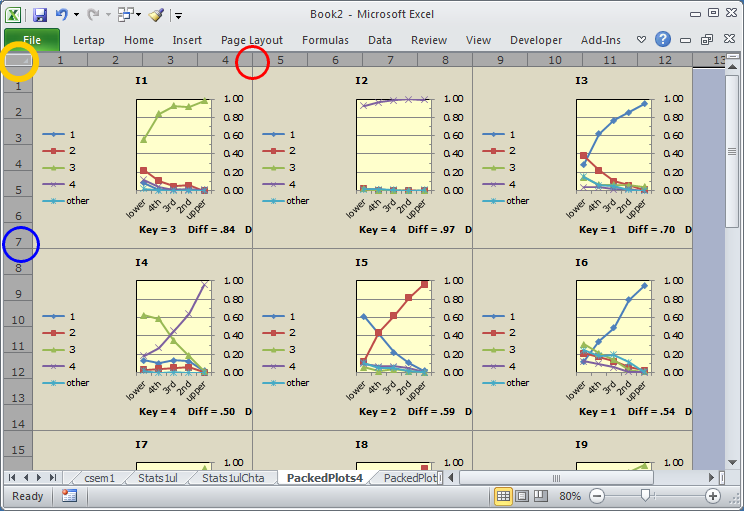
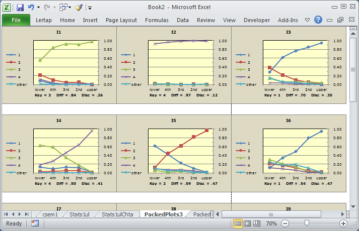
This snapshot shows what ChartChanger3 will sometimes do: create plots which are too squished. Fix them by following the comments in the next paragraph.
Once all the plots have been selected (they should be automatically selected; if not click on the small box circled in yellow), slowly drag a column divider, such as that circled in red above, to the right to make the plots wider. To make them taller, or shorter, slowly drag a row divider, such at that circled in blue. As you do these things the plots will still be aligned with Excel's underlying grid. To get them to print well you'll have to adjust the page breaks, but that's fun and simple: to see how, take in the very bottom of this topic.