Response Charts Toggles

Contents
The screen capture below indicates how to get access to a special response charts menu. The options on this little menu can be quite handy.
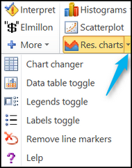
The "Chart changer" option is the gateway to a powerful feature called "packed plots".
The first two "toggles" are used to show or hide data tables and legends.
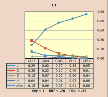
The plot above has a data table. The plot below does not.
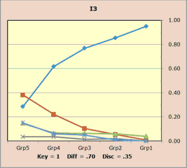
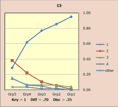
The plot above does not have a legend. The plot below does.
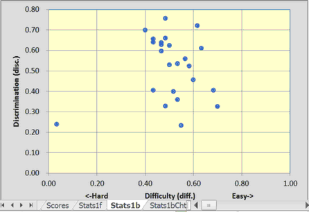
The third toggle, the "Labels toggle", is used to hide or show the item labels seen in a Stats1b scatterplot of item "diff" by item "disc".
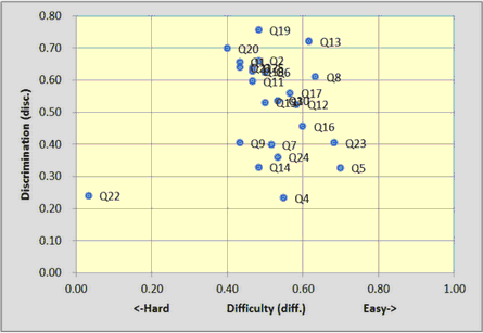
The scatter above is showing the item labels; the scatter below is not.
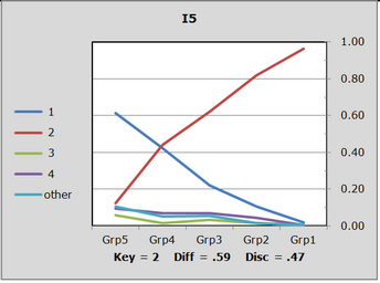
The "Remove Markers" option will delete the markers used to distinguish trace lines:
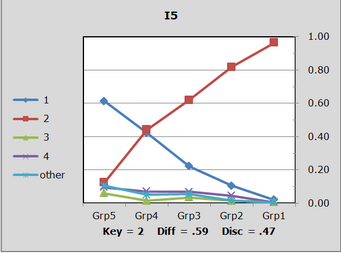
The plot above uses line markers; the plot below does not.
There's a setting in Row 96 of the System worksheet that controls whether or not markers are used when these plots are made:
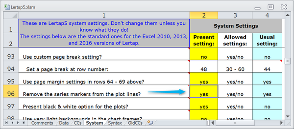
If this setting is "no", then the markers will appear on the plots when they're initially generated. They may be deleted by using the "Remove Markers" option. If the setting is "yes" then the markers will not appear at any time. The "Remove Markers" options is not a toggle -- once one of these plots has its markers removed, the only way to get them back is to create the plots again using the "Res. charts" option, making sure that the Row 96 setting is "no".