Group differences

Contents
Lertap may be used to look at how the five groups in this example may have differed in their scores, and in their item responses.
The best reference for how to use Lertap to look for differences among scores is here.
In this example, the groups are test sites; their codes are found in column 2 of the Data worksheet. Here are excerpts from two of Lertap's group breakouts reports:
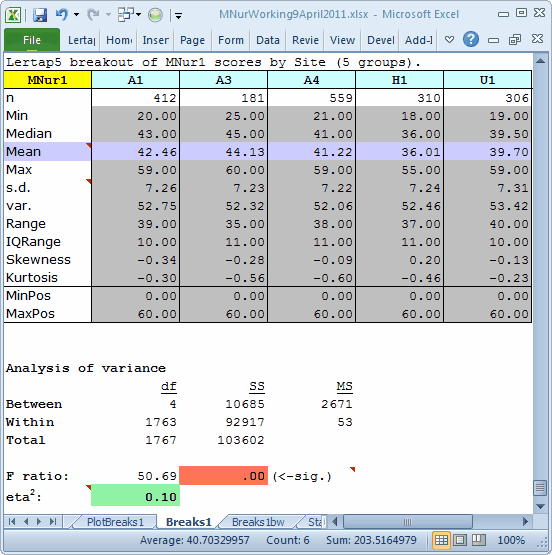

The Breaks1 report, top screen snap above, suggests that there are statistically-significant differences among the five groups (F=50.69, p<.00). When sample sizes are large, care is often required when interpreting the significance of an F ratio as it may be an artefact of sample size, and potentially not meaningful. In such cases we'd be sure to take in the eta2 figure. It corresponds to the correlation ratio, a not-uncommon index of practical significance, an "effect-size" estimator, having a range of 0.00 (no effect) to 1.00 (big effect). Here, eta2 = 0.10, meaning that 10% of the total-score variance observed in these five samples is related to group membership.
The "significant" F and the 0.10 eta2 are both suggesting that there are total-score differences among the groups.
But, fortunately perhaps, we don't have to rely on these statistics for what we want to do here. If there are meaningful group differences, we should be able to see them in a graph.
And we do. Look at the Boxplot seen in the Breaks1bw report above.
There are indeed differences in the group test scores, the "total scores". The best results were turned in by the three sites whose codes begin with A. As mentioned earlier, these sites were all in the same country, one where English is by far the predominant language. The H1 and U1 sites were situated in countries where English is not the dominant language. This may have been a reason for the lower scores found in U1 and, especially, in H1. (There could be other reasons, of course, but we know that the English-language "problem" was of special interest in this case.)
We could try to find out more. We could ask Lertap to prepare some new reports which summarize results at the item level. This level of analysis is referred to as "Ibreaks". The best reference for Ibreaks is currently here.
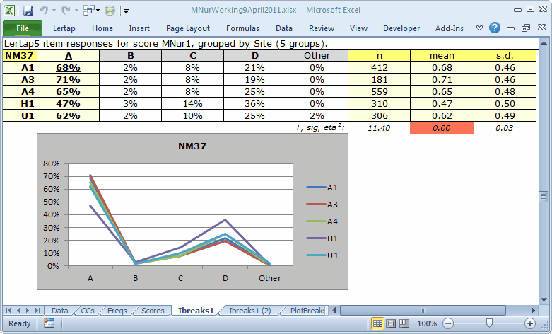
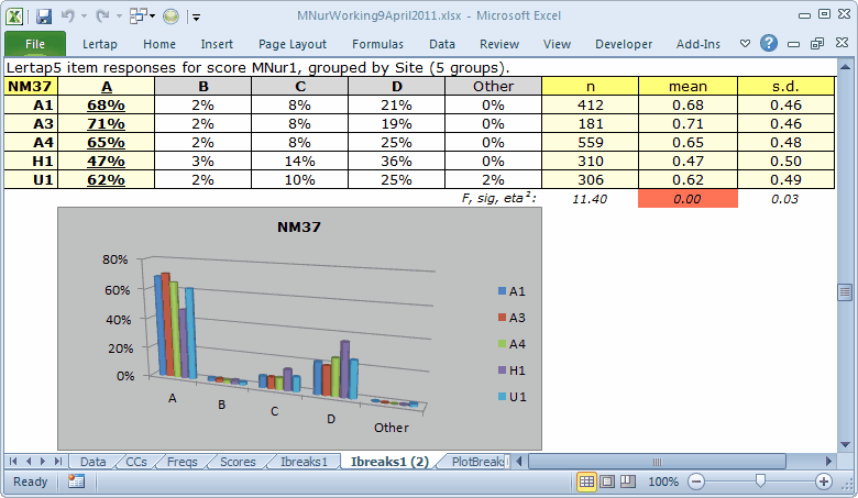
The two tables and corresponding charts above are for a single item, NM37. Only 47% of the H1 students got this item right while over 60% got it right at the other four sites. For some reason, distractor D was more popular with the H1 students.
The chart seen in the first Ibreaks1 table for item NM37 is called a "Line" chart in Excel. These charts can be a bit noisy when there are many groups, that is, difficult to readily interpret.
The second chart is a "Clustered Cylinder" Column chart. Is it easier to interpret? Perhaps yes, perhaps not, depending on your point of view.
What we might like to do is compare H1 with the three A sites. This might enable us to more easily detect where the H1 students seemed to go astray, at least when compared to the A sites.
We'll use Lertap's recoder to (1) combine the three A sites into one group, with a code of A; (2) change the H1 code to H; and (3), exclude the U1 site altogether. Use will also be made of the "chart changer" macro, a tool which turns Excel Line charts into something else, such as (in the case below), Column charts.
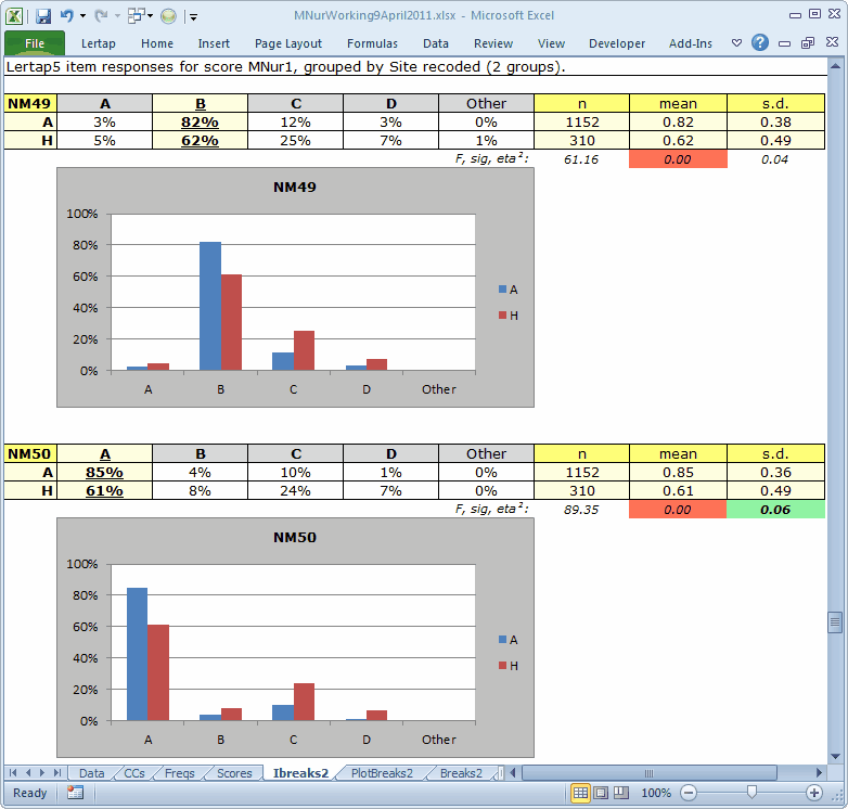
Here we can see two items, NM49 and NM50, where the H students had noticeably poorer results.
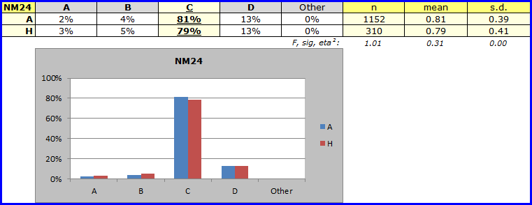
Should you muster your forces, and repeat this work, you'll find that there were numerous other items where the A / H differences were also quite marked. There were also some, such as NM24, with almost no difference:
The large number of items with weak results for the H site led to a mini-investigation of possible problems. Would you like to know what was the outcome? So would we. Language differences were thought to be a likely problem, but then the U1 site, in another country where English is not the dominant language at all, returned results which were not as weak. This test had been administered before, but apparently was not subjected to the sort of scrutiny we have exemplified here. At the end of the day, the results of the mini-investigation have remained confidential.
Tidbits:
The histogram option likes to work with a Breaks1 report. Can be useful.
Lertap has support for DIF, differential item functioning analysis. You might have an interest in DIF when you have two groups known to be equal in ability (or proficiency), and want to see if there were differences in how they did on individual test items. What's that you say? Haven't we just seen a job with two groups, A and H? Yes, good point -- but DIF digs much deeper, making even more informative charts, with even more statistics. Not to be missed. Check it out with on-line help.
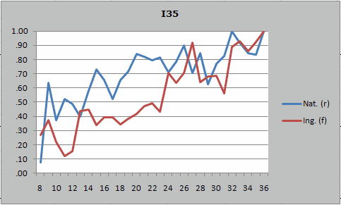
Here's an example of a DIF chart from Lertap / Excel, indicating that on an item called I35, a greater proportion of the blue group got I35 right over most of the score range selected for the plot, 8 to 36: