Print quintiles

Contents
An example of quintile plots (which are Excel charts) is shown below. Read more about such plots/charts here.
There will usually be one chart for each item. 200 items? 200 charts!
Inserted note, 10 January 2015: should you be lucky enough to have Excel 2010 or Excel 2013 on your computer, and have installed version 5.10.5 or better (see how to get it if you don't have it), then you're in "fat city" as far as printing goes: just marvel at this document (a pdf file) and see that Lertap 5 now has a print controller.
On the other hand, if your Lertap 5 is an older version, get a cuppa and read the following.
Printing these charts can require a bit of extra effort for a number of reasons. There are often very many of them. More often than not, they need to be resized so that they will fit on a printed page, and then some more fiddling has to be done to see that Excel does not print part of a chart on one page, with the rest of it at the top of next page.
These things can be done if you have a recent version of Lertap for Excel 2007, Excel 2010, or Excel 2011. (When this topic went to press, respective Lertap version numbers were 5.8.2.1 (Excel 2007), 5.9.2.1 (Excel 2011 for Macintosh), and 5.10.1 (Excel 2010). To see the version number of your Lertap, click on the small yellow smiley face found on the left-hand side of the Lertap toolbar.)
There are two chart-changing macros which can be used to fix up the quintile plots so that they're easier to print. They're called ChartChanger2 and ChartChanger3.
The ChartChanger2 special macro allows you to delete a quintile or two, and then reformat the display so as to recover the space used by the deleted quintiles. ChartChanger2 is available in all versions of Lertap.
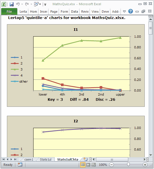
We'll use quintiles from the MathsQuiz dataset as an example of using ChartChanger2.
To begin, imagine that you're playing along with this discussion. Also, imagine that you've got a recent version of Lertap for Excel 2007 or Excel 2010 (version 5.8.2.1 or above).
You download the MathsQuiz dataset, and generate the quintiles there at your own desk, or on your laptop as you float on an air mattress and navigate around the pool.
You get the quintiles for the 15 test items. They're interesting. They're colorful. Many are fascinating. But they're too big. You'd like a more concise display.
You do these things: switch to Page Layout view (small red circle, bottom of screen snapshot below). Turn on gridlines (larger blue circle around the word Excel: click on it and select Gridlines). You use some of the many options under Excel's Page Layout menu to change page margins (purple circle). Lertap always leaves an empty first column on its quintile pages; you reduce the width of this column to zero.
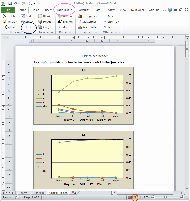
If your printer is set to use A4 paper, you might then see something like the next screen snapshot. (If your printer has "Letter" paper, you'll have a wider but slightly shorter page to work with.)
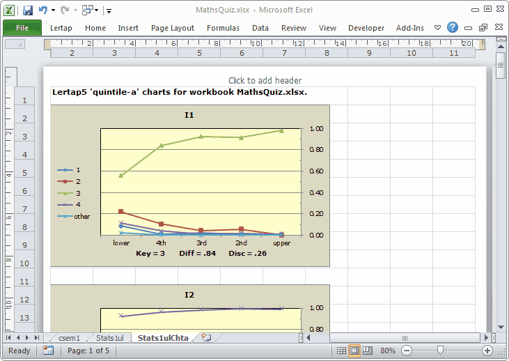
If we continue to work with portrait page orientation, we have 10 columns in the worksheet to play with. We'll grab the first quintile at its lower-right corner, and gently, lovingly, shrink it:
Our shrink has very carefully positioned the first chart so that its edges align with gridlines (is your shrink as good as ours?).
Note for Excel 2010 users: if your Lertap is up to date (version 5.10.x or better), you will have access to ChartChanger3 as well as ChartChanger2. One of the main features of ChartChanger3 is its ability to re-size plots and maintain grid alignment at the same time. Read about it here (also see the Tidbits at the bottom of this topic).
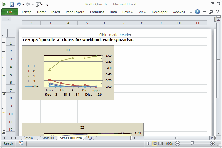
Okay, ChartChanger2, where are you?
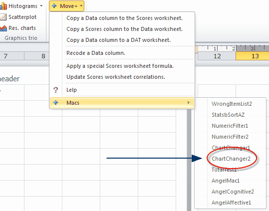
We ask ChartChanger2 to position two charts per row of the display, and opt to have no blank lines between the rows.
(Note that we have now switched on the Page Break Preview option; it's at the bottom of the screen snapshot above, to the left of where it says 70%.)
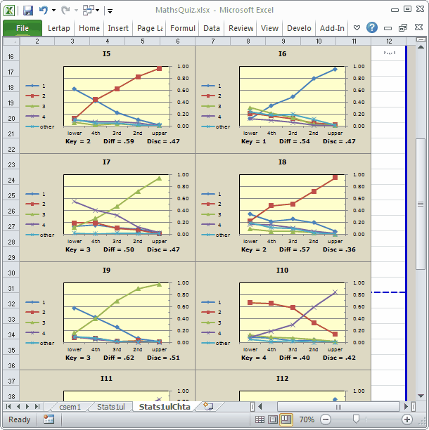
Okay, what have we? The first eight quintile charts, corresponding to items I1 through I8, will, according to the screen snapshot above, fit on the first printed page, as will the upper portions of the charts for I9 and I10.
We've got a bad page break. Worse than bad breath (to some). We don't want those "upper portions"; we want whole charts, not parts. Can we get all of charts I9 and I10 to appear on the next page?
Certainly. Easy peasy.
We position the mouse on the blue dashes to the right of I10's chart, and drag the dashed line up, ever so slowly, ever so carefully, stopping when it's level with the top of the I10 chart.
Ready, set, print. Turned out well. How you'd go at your place?
Tidbits:
Access to the ChartChanger3 macro may be available to all users, even those without Excel 2010. A version of it is likely to be found in the Lertap5MacroSetA.xlam file. Write to larry@lertap.com for help.