Scaling an RSAsig histogram

Contents
It was mentioned in the previous topic that the Histograms option will work with a Scores worksheet, with a Breaks report, and with an RSAsig report. In this topic you'll find some special comments on histogramming the results from an RSAsig worksheet.
The chart below was made by first using the Histograms option when looking at an RSAsig report, followed by use of the Histogram E option:
1.png)
It's often of considerable interest to have a more precise display of what's going on in the left tail of a Log(PROB) plot. To do so, right-click on one of values on the Frequency axis, and take the Format Axis option:
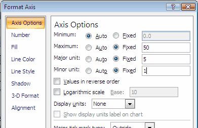
Above the Maximum has been set at 50 (the former value was 1200). Click OK, and: You called tails?:
2.png)
Changing the scale of the (Y) axis has made the left-most Log(PROB) outliers visible. Note that these outliers are also sort of visible in the corresponding HistoL sheet:
3.png)
Look carefully at the f column above, and you'll spot the outliers below the score of -14. There aren't many, but the presence of just a few can influence the interpretation of an "RSA", that is, a response similarities analysis.