Line grapher

Contents
![]() This option is a little gem.
This option is a little gem.
Here at Lertap HQ there's often a real urge to make line graphs from Lertap reports. For example, we will commonly get into a "Stats1b" report, and graph item difficulties, and also item discrimination coefficients. We'll use the Run menu to "Output an item scores matrix", from which we'll plot such things as item means and variances. And we often go for a scree test by plotting eigenvalues.
The little ![]() icon option makes it possible to get such plots with ease.
icon option makes it possible to get such plots with ease.
How to use this option? Couldn't be easier: select the cells you want to plot, and then just click on the ![]() icon. That's it? Yes; assuming you have selected cells which have numeric data in them, Excel 2007 will present its line graphing options, and in another click you'll have that graph.
icon. That's it? Yes; assuming you have selected cells which have numeric data in them, Excel 2007 will present its line graphing options, and in another click you'll have that graph.
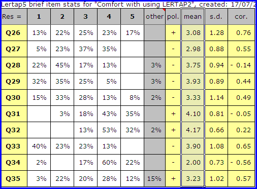
Here's an example -- we wanted a plot of item means as found in a "Stats2b" report.
We selected the cells of interest by running our mouse over them (there are 10 means values selected in the screen snapshot seen below, and note that we started selecting in the 'mean' cell):
Then we clicked on ![]() .
.
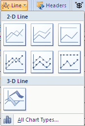
Excel 2007 popped up its select-a-chart-type box, seen above. We clicked on the first chart type, the one in the upper left. This gave us what we wanted:
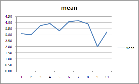
You can modify the resultant Excel chart, the line graph, by using Excel's standard chart options, of which there are many. You can add titles, legends, and change lots off colours ... why, you could probably spend two or three hours enhancing Lertap's initial plot, ending up with a graph which, when pasted into your final report, is bound to bring you great kudos.
One thing that's really neat about these line graphs is that you can see the x and y values associated with any of the line graph's points by just letting your mouse hover right above one of the points. Try it -- you don't need to hold down a mouse button -- just position the mouse pointer on top of a point, and the corresponding x and y values will jump out at you. (Note that this won't work with the graph above as it's just a picture of Excel output, not the real thing.)
What's that you're saying? You'd like to know more about Excel charts? Goodonyou. Use Excel's Help system -- it's got heaps of info. Heaps.
Line graph problems
Users just starting to use Lertap's line grapher shortcut may find that it won't work as advertised here. In the tests we've done to date, the problems which arise have to do with selecting cells.
Cells are selected in normal fashion: by highlighting them with the mouse, or by holding down the Shift key and using the arrows on the keyboard. The cells are expected to have numbers in them -- however, the first cell selected can have text information, such as a row or column header -- if Excel finds the first selected cell to contain text, it'll use the text as a title for the line graph (this can be real handy).
Lertap will fail to make a line graph if: no cells are selected; only one cell is selected; or if the selected cells do not contain numbers (except for what we've just mentioned: the first selected cell may contain text).