Reliability

Contents
I begin my investigation of item and test quality by clicking on Lertap's Interpret option.
Lertap and Excel team up to make sure they can understand, or "interpret", the control lines I've placed in my CCs worksheet. All being okay, these two then get together to make the "Freqs" report. (There's actually a bit more that happens. If you want to be full bottle, read this.)
Mention has already been made of how I use Freqs as a check on data quality. It's invaluable to me, always my first stop, and the reason I don't run in "production mode": I want to make sure my data are free of data preparation and processing errors before going on to bigger and better things. Even when data records have been generated by the use of a scanner there are often errors, or, at least, unexpected results.
Next I go for Lertap's Elmillon option. It links to computer code which was originally written for the Venezuelan Ministry of Education in 1972. Elmillon has been enhanced over the years -- when it was born it produced just one statistical summary, now known as the "Stats1f" report (f for full). Later the "Stats1b" report was added (b for brief); it is a condensed version of Stats1f with a handy little chart at the bottom, a scatterplot of item difficulty by item discrimination. Still later another report, "Stats1ul", was put on basically as a means of getting item response plots, often referred to in Lertap as "quintile plots" (ul for upper-lower).
The information in these reports is not really unique. Each report looks at the same thing, how students have responded to the items, but they summarize the results in different ways. I know that not all users make use of all of these reports. That's fine; it is possible to find out how the items have performed by using just one of these three reports -- you choose. I use Stats1b as a starter, and then usually make packed quintile plots. After this I'll brew a fresh cup of coffee and go down the Stats1f report.
When Elmillon completes its run, Excel will focus on the bottom of the Stas1b report, as exemplified below:
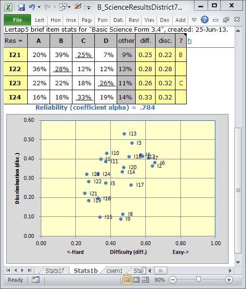
The reliability figure, coefficient alpha, is low at .784. It should be over .80; ideally over .85; ideally ideally over .90.
Can you make out the labels on the three lower blips in the chart? Items I8, I9, and I15 have the lowest item discrimination figures ("disc."), with values around 0.10. These items have undoubtedly served to bring down coefficient alpha. When all of a test's items have discrimination figures at or above .30 we will, generally, be in better shape, and be rewarded with a higher reliability figure.
Later on I'll show how we can improve I8's discrimination so that it rises above .30. First, I want some "packed quintiles". I show how to get them in the next topic.