Age breakout

Contents
I wish now that I had suggested a reason for saying that it might be useful to look for Age differences. I didn't, but now I'll sneak this question in: "Were there age differences in test scores?".
What I'm thinking of is the situation where students are held back a grade for one reason or another. Or, the case where some students started their schooling later than others. When this happens a classroom will of course have a mixture of ages -- indeed, back a few topics I got Excel to create a "pivot table", and there I saw considerable age ranges in both of the grade levels I've been looking at (Standard 4 and Standard 5).
Where in the Data worksheet is the Age variable, or field? It's in column 3 (see it here).
That pivot table indicated that ages ranged from 8 years to 14. Okay, now I'd like to see how test scores varied over the age levels.
Where are the test scores? In the Scores worksheet. They're labeled as "BSci3.4". See here.
(Someone in the audience has sent a text message, asking why the test scores are known as BSci3.4. I gave the scores this title in the CCs worksheet, which you may see here.)
Were there age differences in test scores?
There are two ways I might go about answering this question with Lertap. The quickest way is to ask for a "scatterplot" of test score by age. Lertap's scatterplotter is one of the options in the "Graphics trio" on the Lertap Excel ribbon tab.
The scatterplotter wants to have both of its variables in the Scores worksheet, so I need to copy the Age column from the Data worksheet to the Scores worksheet. Easy peasy, I did this sort of thing earlier, when I wanted to move the 9s filed from Data to Scores.
Once I've Aged the Scores worksheet, I click on the Scatterplotter icon on the Lertap tab, and before I can go to the galley for another cup of tea, I see this:
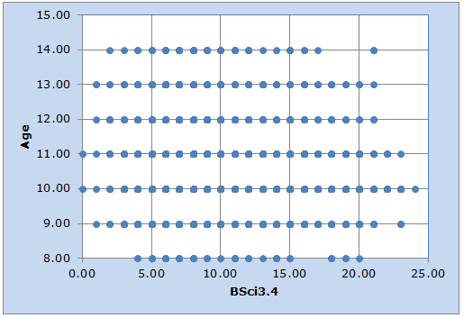
This graph may be pretty, but it's only marginally informative. The number of students behind each of the blips in the scatterplot is not at all apparent. Take, for example, the blip seen at Age = 10.00 and BSci3.4 = 5.00. There may be tens of, or perhaps hundreds of age 10 students with a test score of 5.00. We can't tell.
So, I'm going to take another option. I'll ask for a "Breakout score by groups" where, this time, the groups are defined by the Age variable.
However (alert! alert!), there can be a problem when Excel is asked to make some of its charts when the x-axis variable is not categorical. This problem is mentioned in the caveat seen here.
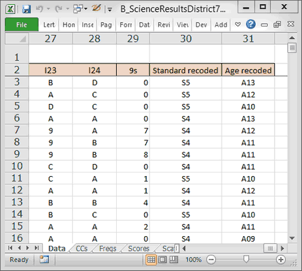
Accordingly, I make use of Lertap's fun-to-use recode option, and add another column to the Data sheet where the 8-year-olds are recoded as age "A08"; I'll also make new age codes of A09, A10, A11, A12, A 13 and A14.
Now the right-most side of my Data worksheet looks like this:
Ready? I take the "Breakout score by groups" option, and this is what I get:
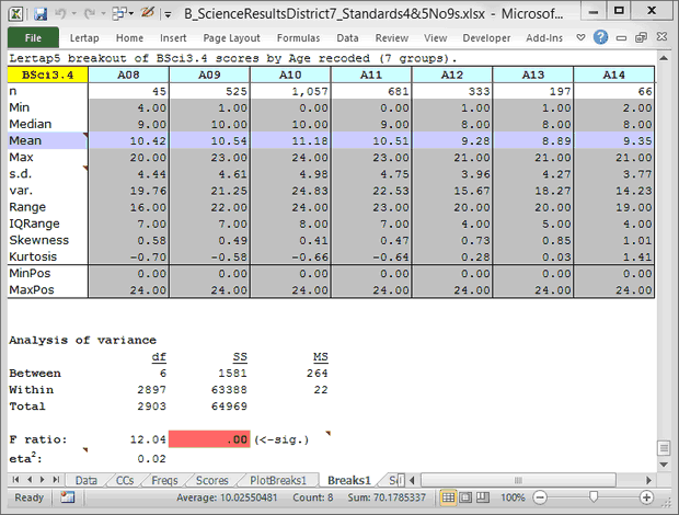
Just looking at the Median row, at this point it does not seem to me that there are substantial score differences by age level. What is of some interest is the "IQRange" row (the inter-quartile range, the difference between the 75th and 25th percentiles of the score distribution). The scores seem to cluster closer together in the A12, A13, and A14 age levels.
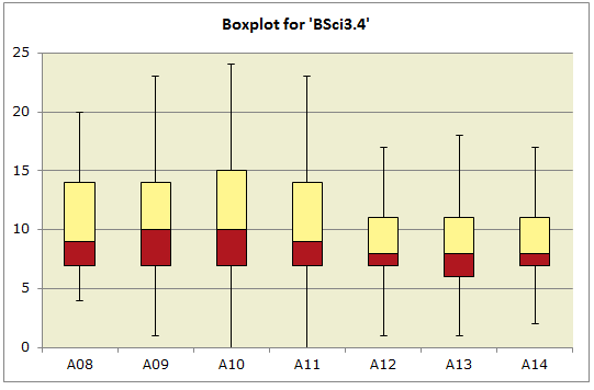
I need a Boxplot.
Were there age differences in test scores?
Well, certainly! The groups have different medians, means, and score ranges. There are clearly differences.
The question must be refined: Were there meaningful age differences in test scores? As a principal, should I be concerned about the differences noted?
I might be. The A12, A13, and A14 students did not do as well as the others on this test. If I were to see the same pattern repeated on other tests, and in different subject areas, I might get the staff together and discuss the situation, asking if we need to perhaps lay on some remediation for the older students.
But note: this presupposes that the test had adequate statistical properties. If I've got a test with poor reliability, I would tend to downplay these results. Putting on remedial sessions takes resources, and my budget isn't that healthy. I want to be looking at test scores that have come from good quality tests.
Another note: isn't the value of Lertap/Excel's charts apparent here? The table of statistics is fairly lifeless when compared to the Boxplot.
Another another note. If you're familiar with analysis of variance methods, and with tests of "significance", you will have perhaps noted above that the differences in group means are statistically significant at the ".00" level. This is an artifact of sample size in this case; hundreds of student test scores are involved here. What you might take in, something more useful, is the little eta2 statistic. At .02, it's suggesting that the differences are not all that large (but they could nonetheless be meaningful to me as a principal). Read more about eta2 at the end of this topic. Finally, if these students constitute the population of interest, and are not a carefully-selected sample from a population, then there's no need to look for statistical significance, the F ratio will have no relevance whatsoever -- but eta2 will.
What's next?